
Your manager just asked for “something visual” for the 9am meeting, and all you’ve got is a spreadsheet with 40 rows of raw numbers and an hour to spare. Nobody’s going to read a wall of cells in a slide.
Piktochart is an AI-assisted chart and infographic maker that turns spreadsheet data into a finished visual automatically. It’s built for people who need to present data but don’t have design skills or design software.
What it is
Piktochart is a data visualization tool that takes raw numbers — a spreadsheet, a CSV file, or numbers you type in — and turns them into a chart, graph, or infographic. You pick a style, drop in your data, and it handles the layout: colors, labels, spacing.
It’s a full design tool, not just a chart plugin, but the AI part takes care of the layout decisions so you don’t have to.
Try it in 5 minutes
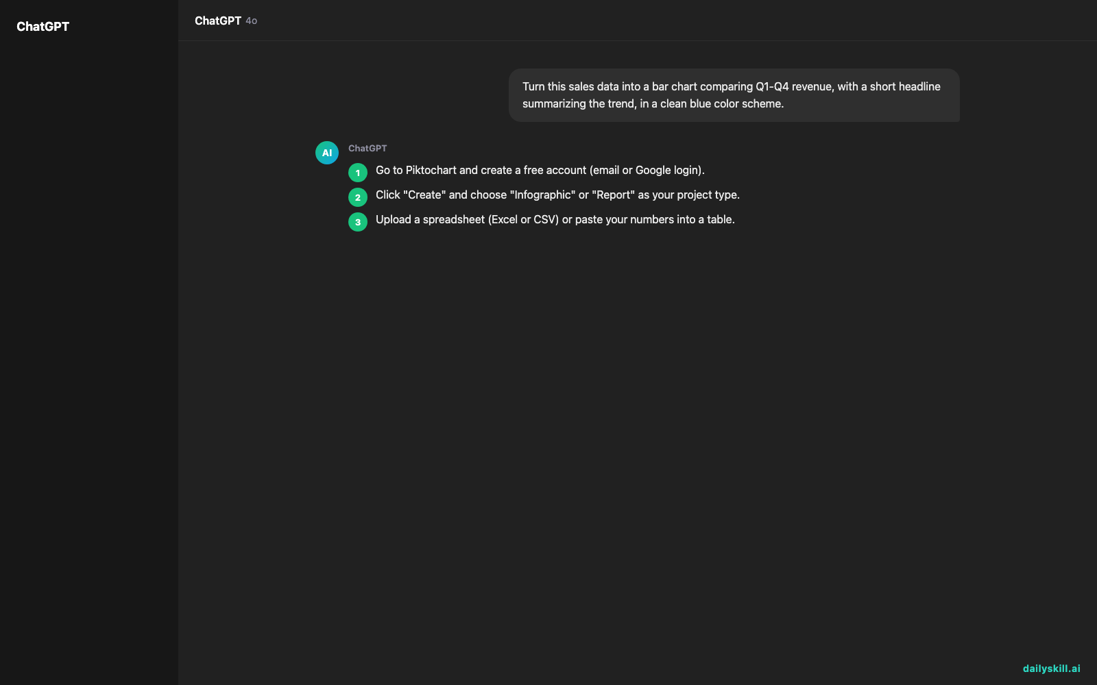
- Go to Piktochart and create a free account (email or Google login).
- Click “Create” and choose “Infographic” or “Report” as your project type.
- Upload a spreadsheet (Excel or CSV) or paste your numbers into a table.
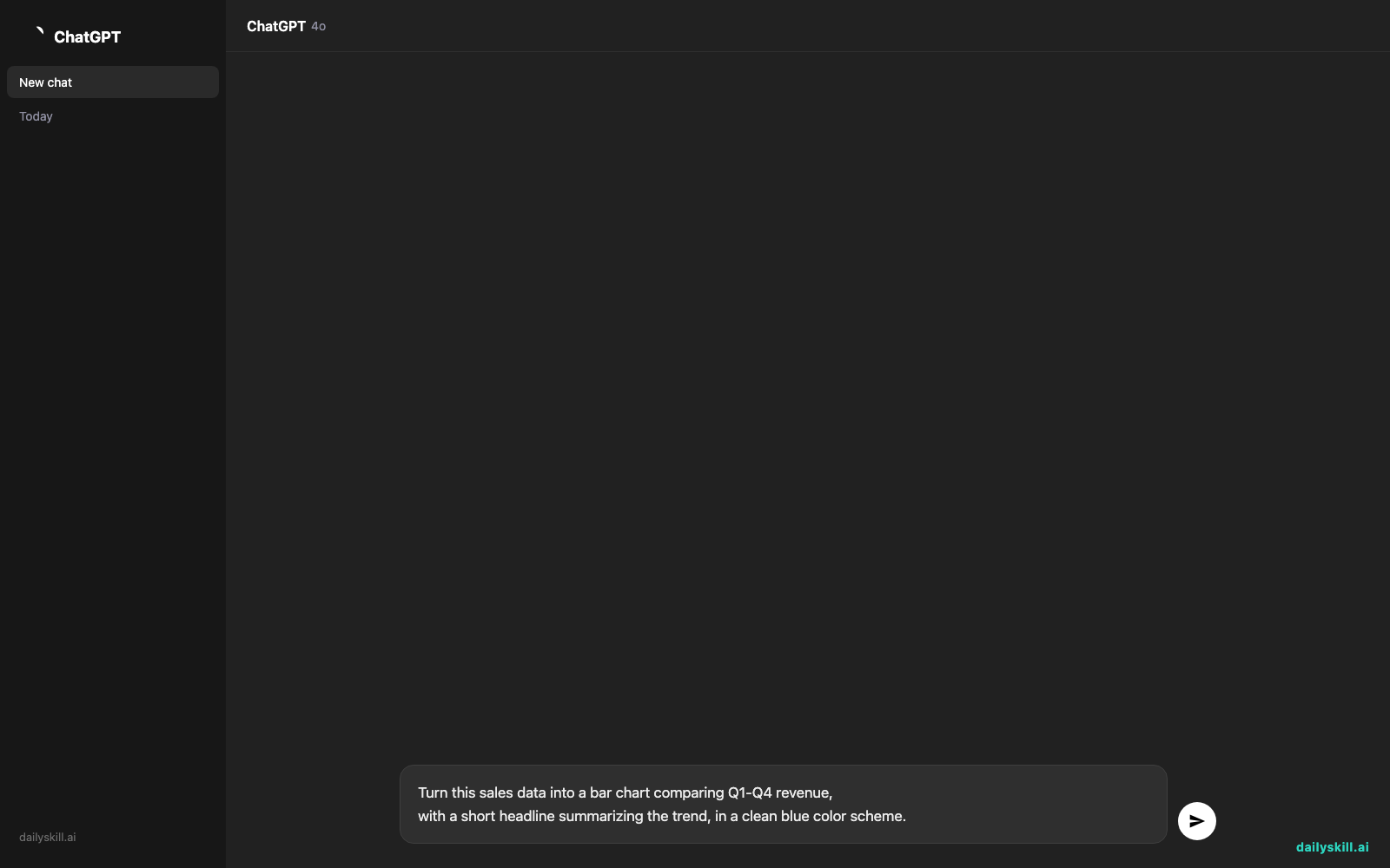
- Use the AI generator prompt box and describe what you want, for example:
Turn this sales data into a bar chart comparing Q1-Q4 revenue,
with a short headline summarizing the trend, in a clean blue color scheme.
- Piktochart builds a draft. Swap colors, fonts, or chart type with a click, then download as PNG or PDF.
A real example
Say you paste in monthly expense data: Rent, Software, Marketing, and Payroll, each with 6 months of numbers.
Piktochart returns a stacked bar chart with each expense category color-coded, a one-line headline reading “Payroll drove 62% of Q2 spending increase,” and a small legend — ready to drop into a slide deck.
You didn’t pick the colors, size the bars, or write the headline. It pulled that from the data on its own.
Honest take
Best for:
– Presenting data to non-technical audiences at work — managers, clients, teams
– Turning a spreadsheet into a one-page report without opening design software
– Quick infographics for internal updates or social posts
Not for:
– Interactive dashboards you can click and filter — these come out as static images, not live tools
– Highly custom or scientific charts, where the templates start to feel limiting
The free tier gives you basic templates and limited exports, which is fine for occasional use. If you’re making charts weekly, the paid plan’s extra templates and higher-res exports are worth it.
FAQ
Is it free? Yes, there’s a free tier with basic templates and exports, but premium templates and larger exports need a paid plan.
Is it safe to upload my data? It’s a legitimate, established company, but avoid uploading anything highly sensitive — financials, personal data — unless you’ve checked their current privacy policy first.
Do I need design experience? No — that’s the whole point. You pick a template, and the layout is handled for you.
Today’s pick wrap-up
Piktochart won’t replace a data analyst, but it’ll save you an hour of dragging boxes around in a slide deck. Try it on your next spreadsheet and tell us how it went in the comments. Tomorrow: Otter.ai, for turning your meetings into notes you can actually search later.
You might also like:
Master Everyday AI in 1 Minute a Day
Get our free 2026 Double-Blind AI Benchmark Scorecard & 20 Ready-to-Use Prompts, plus one honest, 60-second AI skill in your inbox every morning. Zero hype, plain English, cancel anytime.